D.R. Horton is the #1 homebuilder by volume in the America. The relaunch of DRHorton.com was the first large scale project for the digital marketing department and the first project for the company with any emphasis on UX that would be public facing.
As the experience design lead for this initiative, I was honored to direct the workflows, front-end design and the implementation. Over the course of the project, I worked with all levels of the business.
I worked with business analysts to better understand the technology stack and produce functionality requirements.

I worked with an external development partner to update the existing software, perform UI sync ups of wireframes, and receive updates from QA.

I worked with senior management and the executive team to set expectations and present the value that my initiatives would bring to the company.

“The relaunch of DRHorton.com was the most successful implementation we have seen to date for the company – from any department”
Executive Vice President with D. R. Horton Inc.
Throughout the project, I was accountable for identifying the many usability issues on the existing site that needed to be addressed including:
- Workflow for content editors was inefficient and time-consuming
- Lack of integration with a system of record resulted in data integrity issues
- The existing navigation made it difficult for customers to find a page with relevant content
- User research showed that home buyers wanted to see multiple large, high quality images in a gallery format
- The existing site’s mobile experience was difficult to navigate and didn’t offer relevant information
The Results Were Incredible
Increase in Traffic
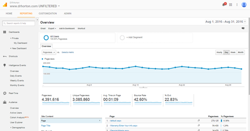
In the first month, we saw a nearly 300% increase in web traffic, in addition to increased page views and time on the page.

100% User Adoption
Many of content editors who were not updating the site previously now saw value in providing content and keeping the site up-to-date.

Decrease in Clicks
The improvements to site search resulted in reducing click through from 5 clicks to 1 click for the home page to a page with relevant content.

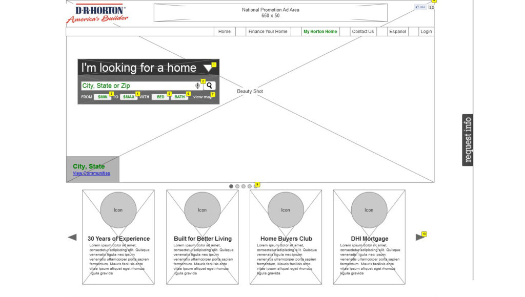
Home page before the relaunch

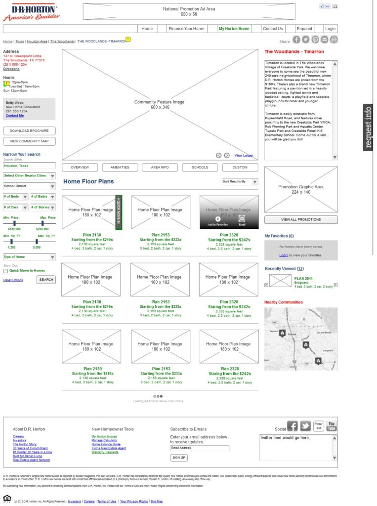
Website after the relaunch


I led three essential phases of this initiative

User Research
Internal Survey
User Interviews
Task Flow Analysis
Competitive Analysis
Design
Internal Survey
User Interviews
Task Flow Analysis
Competitive Analysis
Usability
Design Walkthrough
Usability Testing
Site Analytics Review
User Surveys


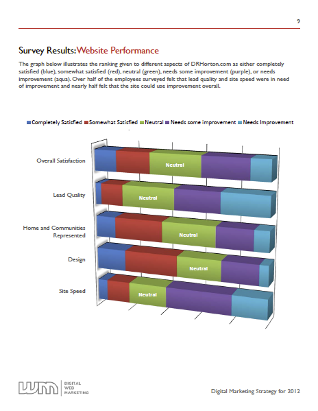
Internal Survey
I conducted a survey of the internal customers to better understand the business and the goals they would like to achieve through technology. The survey was sent to all sales and marketing contacts within the company. I received over 200 responses, primarily from sales agents in the field, but also from division president’s, city managers, sales managers, online sales and marketing managers.
Some of the key findings from the survey included:
- The existing website was not providing basic functionality to support the business such as detailed information on floor plans, functional maps/directions, printability and image galleries.
- The site was difficult to navigate and took too long to load.
- The mobile experience was not ideal and was not being utilized by consumers – both internal and external.

User Interviews
I expanded on the survey with individual user interviews to determine how the website could be utilized to help achieve the goals of the business. I held calls with 2 groups of users – online sales consultants and marketing web administrators.
The take aways from these interviews were alarming:
- Online sales consultant’s were not getting enough leads from the website because their information was not easily visible on pages throughout the website.
- Marketing website administrator’s found the website difficult to update and often were not keeping the website up-to-date at all because they did not see the value.

Task Flow Analysis
I analyzed the flow for search on the existing website and evaluated how it could be more efficient and better assist end users in reaching a page on the site with relevant content. The existing website’s navigation was a Flash map animation that required 5 clicks on average to reach a page with relevant content. The animation was inefficient and slow to load.
To improve this experience, I evaluated all the possible routes a user would take from the home page. I determine how we could easily direct consumers to these pages with the least amount of clicks possible.
I identified a few essential features in achieving these goals:
- By utilizing a search bar on the home page with suggested search results, consumers could reach a page with relevant content within 1 click vs. 5 clicks.
- Providing consumers with a content page specifically for floor plans and quick move in homes would improve usability and click through by enabling the consumer to bypass the community page (the existing site displayed this content via a pop up window).
- Adding relevant content to each page on the website such as imagery, videos, online sales contact information and accurate maps/directions would reduce bounce rate and increase time on the page.

Competitive Analysis
I researched other realty sites such as Zillow, Trulia and HGTV Front Door as well as direct competitors like Lennar, Pulte and KB Homes to identify what they were doing well and what they could be doing better. I created a feature comparison table detailing what features were desirable for the new website, which competitors currently utilized this functionality and what was being utilized on the existing site for D.R. Horton.
The results of this analysis showed that while leaders in the industry such as Zillow and Trulia had many of the desired features and excelled at usability, the direct competitors sites did not. This was a tremendous win for our team – by creating this feature table, we could now show that with the functionality proposed, we had the opportunity to jump ahead of the direct competitors in the market.


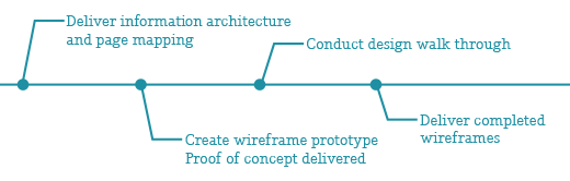

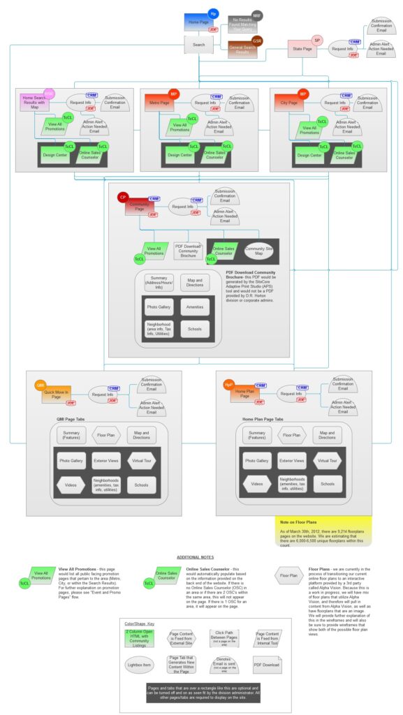
Information Architecture and Page Mapping
Using data obtained during the user research process, I created the IA and page mapping. Once delivered, this was utilized by the external development partner to determine the full scope of the project and deliver a proof of concept.


Wireframes
I created a wireframe protype to present during the design walkthrough to our internal customers. After the design walk through, I made adjustments to the protype and added detailed notes. I presented the updated wireframes to the executive team and senior management at D.R. Horton, obtained final approval and delivered the final wireframes to the external development partner.

Design Walkthrough
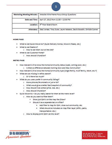
I conducted a design walkthrough with our internal customers throughout the country via an online presentation to determine if the direction we were proposing would meet the needs of the business identified in the internal survey and user interviews. We held 4 different walkthroughs for 4 different user groups:
- Online Sales
- Marketing (including website administrators)
- Sales Managers
- Sales Agents
Some of the action items from the walkthrough included:
- Users wanted the ability to feature communities, plans and promotions on the website.
- The community/plan information was more important to show on the page than the online sales contact information.
- It was desired that social media information displayed was relevant to the geographic area.
“The wireframes Laura delivered had a level of detail I had not seen on previous projects with other clients. It basically made it impossible for my development team to use the excuse that something was not delivered on time because a requirement was unclear.”
Chairman and CEO with an external development consultant company


Usability Testing
I conducted extensive testing throughout the implementation process to ensure that both the front end and the back end experience were user friendly and efficient. In addition, I lead our department in testing the site, documenting issues effectively and delivering detailed bug reports to the external development partner.


Site Analytics Review
I worked with our analytics team to properly tag items throughout the site, specifically forms, so that we could track actions and learn from user behavior. I lead the team on executing user experience improvements to the site based on the data obtained.
Some of the highlights from the analytics review included:
- Traffic increased nearly 300% within the first month.
- Bounce rate decreased and time on page increased.
- Conversion significantly increased, but over time, we saw that the abandon rate was higher than desired. We made adjustments to how the information was presented on the request for information form and reduced the amount of required information. These changes results in a reduction in the abandon rate.

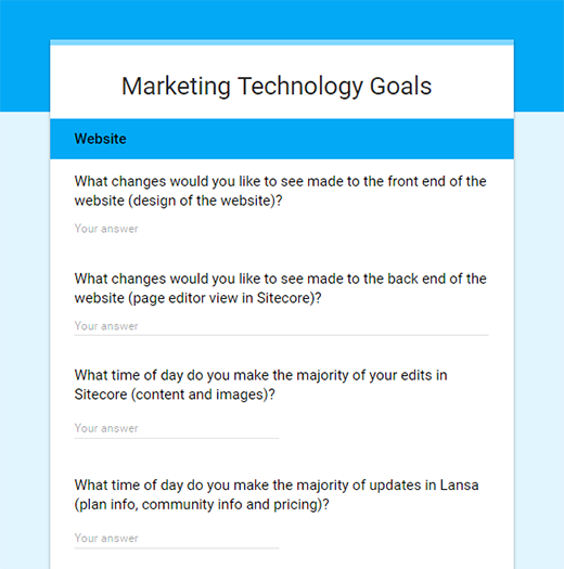
User Surveys
As an ongoing task since the launch of the website, I have conducted several user survey with our internal customers to identify their pain points and understand what additional issues they are having with the site. From this data, I established what could be improved from a user experience stand point to continue to make the site more effective.
Some of the features I have identified during these surveys and addressed include:
- Improving back end load times and publishing times.
- Enabling content editors the ability to adjust the pin placement on the map for a community shown on the front end of the website with an easy-to-use drag and drop functionality.
- Creating a workflow that would enable the ability to provide legal approval for promotion pages loaded to the website.
Some Additional Highlights
Encouraged Data Integrity
I worked with internal IT to create a middleware that would enable the website to be integrated with our accounting platform to ensure the information presented on the website was accurate with what was being reported.

Promoted Scalability
I established standards to keep data items and media consistent throughout the site. I lead a team to update the existing content and implement these standards prior to go live.

Mobile Experience
I led usability testing, established functionality requirements and ensured the mobile project was delivered on time and on budget.
